How To Find Your Personal Contrast Level And Why It Matters
A reader wrote in with a question. I get more than you’d think. She’d gone gray and noticed that some colors in her seasonal palette were suddenly working better than others. She wanted to know if there was a formula she could use to sort it all out.
There is, and it starts with contrast.
Most people focus on finding the right colors for their complexion, which makes sense. But your personal contrast level is just as important, and it’s often the missing piece when an outfit feels a little off, but you can’t quite put your finger on why.
Before we get into how to find yours, it helps to understand how color actually works. Every color has three components. Hue is the color itself, think red, yellow, blue. Value is how light or dark that color is. Saturation is the intensity or purity of the color. All three play a role in whether a color combination flatters you or flattens you.

Our hair color, skin, and eyes all have a value (light to dark) on a sliding scale. Our personal contrast level is the difference between them. Wearing contrast levels that match your own contrast levels is as important as whether the undertone is warm or cool. In some instances, it’s more important!
High contrast is when there’s a large difference in the lightness of one or more colors. For example, if you have very dark hair and light blue eyes, you have a high-value contrast. However, if your dark-colored hair has gone a medium grey, it will lower the difference (contrast) with your eyes. As our hair goes gray or silver, our personal contrast level will shift.
If you have light silver or blonde hair, fair skin, and pale eyes, you have a low contrast value and will look best in low-contrast outfits. Medium value contrast is when there’s a difference, but it’s not extreme.
Contrast levels that are too strong overpower and wash you out. Conversely, wearing a contrast that is too low reduces your visibility. Knowing and wearing outfits that echo your personal contrast levels keeps you looking vibrant and visible at a time when society often overlooks midlife women.
How to find your personal contrast level
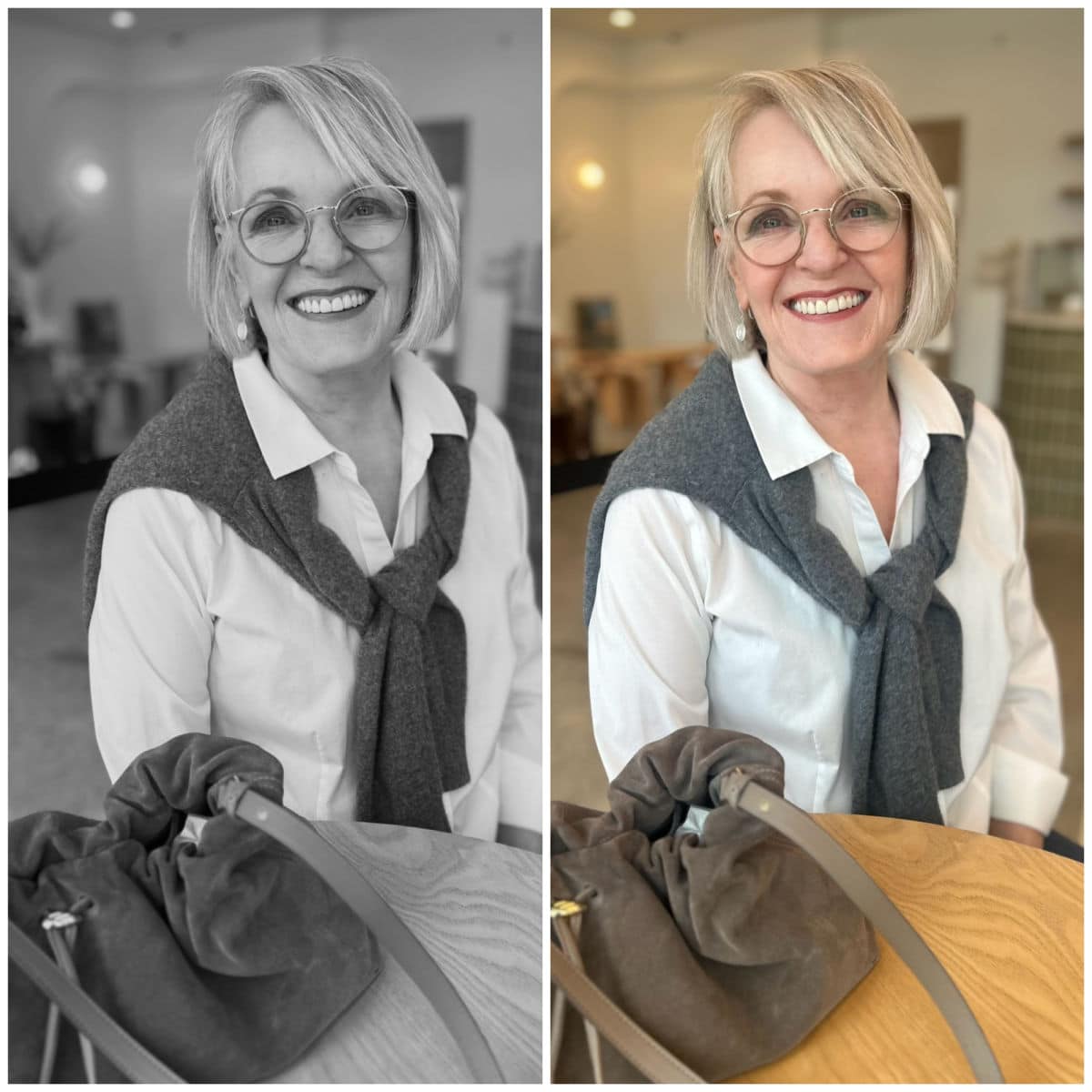
The easiest way to see your inherent color contrast is to take photos of your face and hair. Then, use the settings on your phone to change it to a grayscale, monotone image. Now you’ll see the difference in the intensity of your hair, eyes, and skin. I have makeup on in my photos, but you can still see the difference.
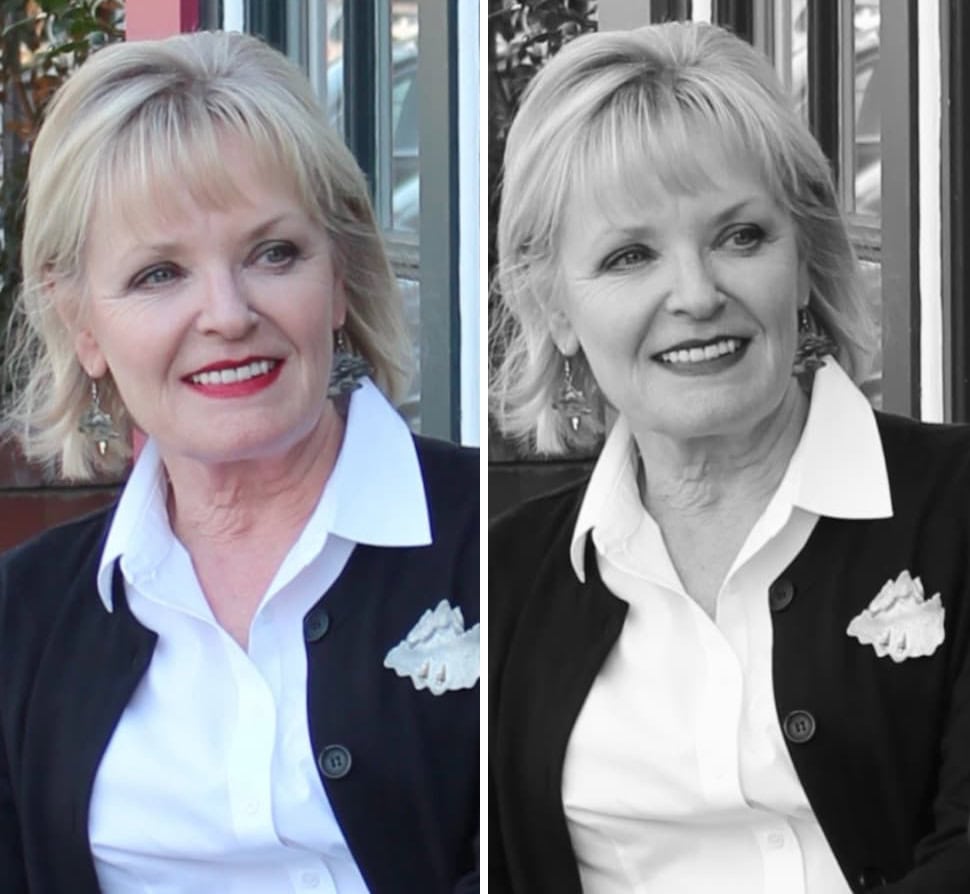
The black and white have a strong contrast that overpowers me. The red lipstick attempts to make it flattering, but falls short in the monochrome image. The black jacket is intense against my complexion. Its contrast with the white shirt draws your eye to the garments rather than to my face.
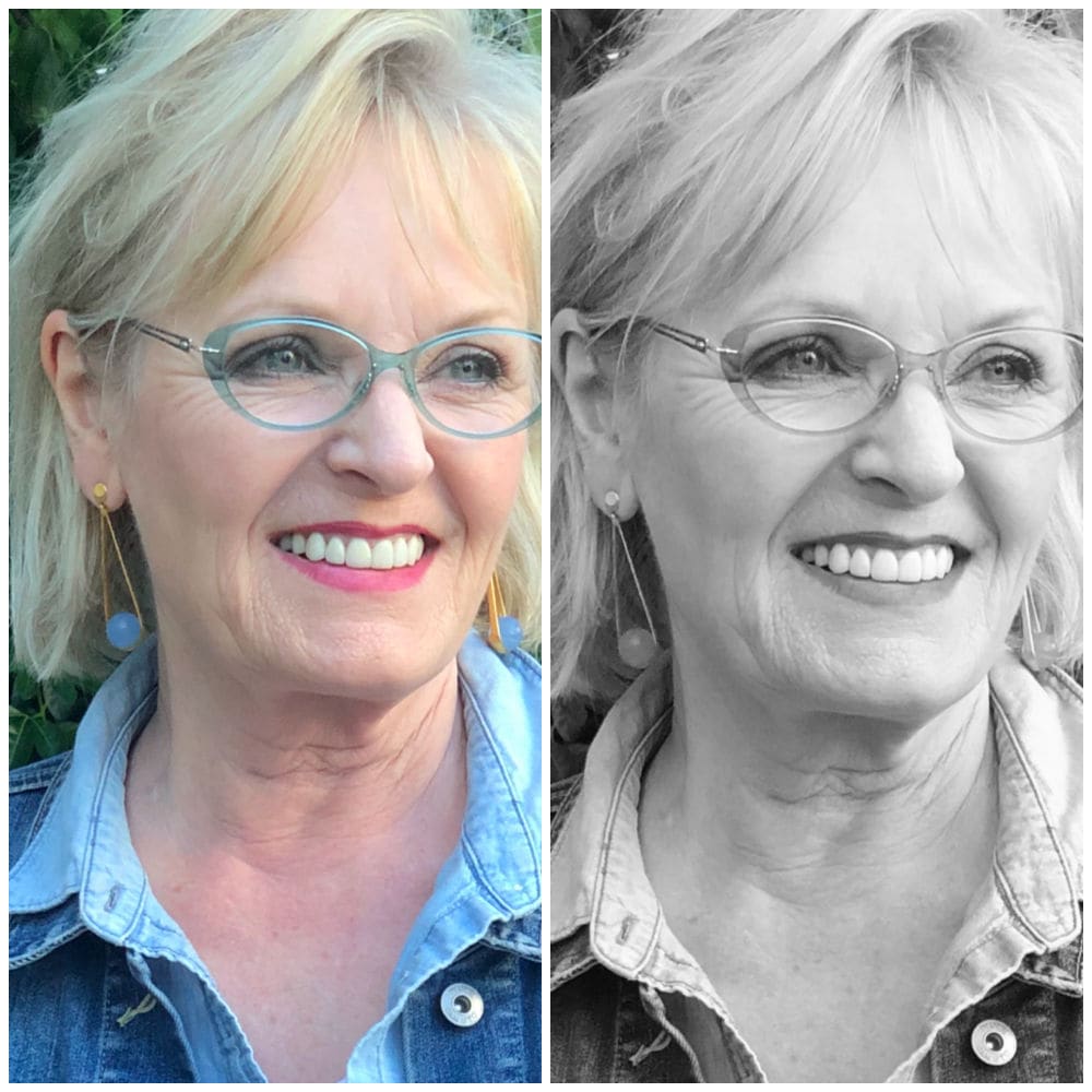
In this photo, I have highlighted pale ash blonde hair. Along with my fair skin and medium eyes, I have low-to-medium contrast values that match the chambray shirt and denim jacket. My eyeglass frames and lipstick are also a low contrast, which doesn’t overpower my coloring. My low intensity is also why I am flattered by monochromatic outfits, as they are the epitome of low contrast.
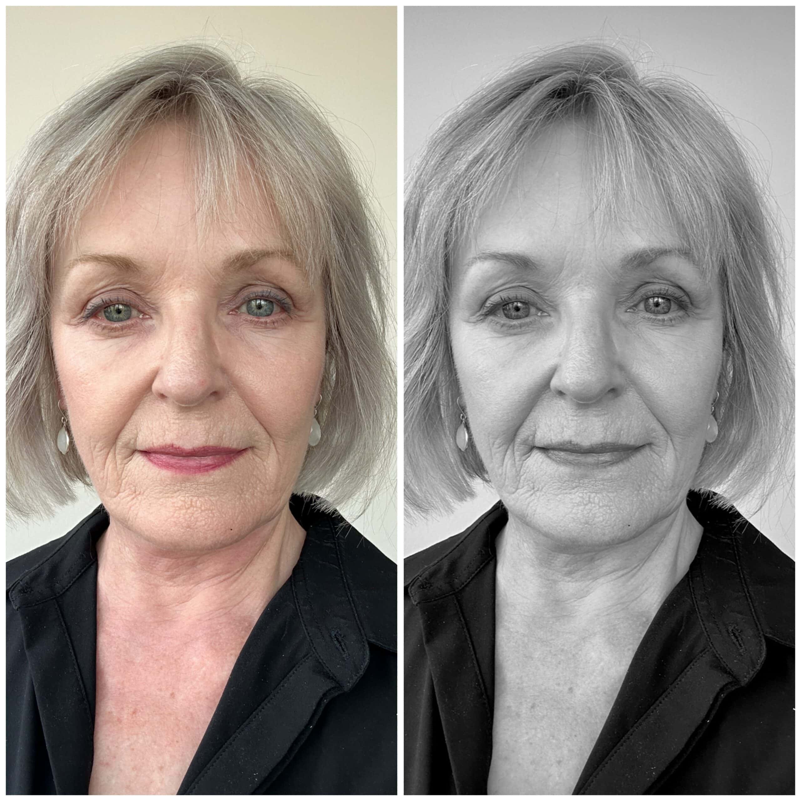
Since I’ve let my hair go natural (silvery), the contrast between my hair and eyes has become even softer than when I was highlighting it. This black shirt looks even starker against my low contrast coloring, so my head looks like it’s floating.
Below is another example using outfits. The same sweater with different-wash jeans is a great example. High contrast is when there’s a big difference between one or more colors. Low contrast is when they’re very similar. Medium contrast is when there’s a difference between them, but it’s not extreme.
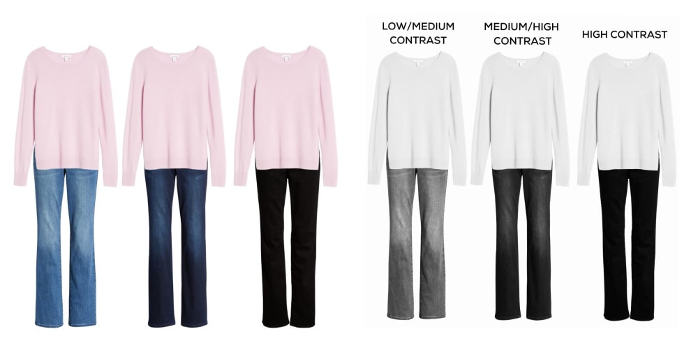
When we remove the color, you can see the contrast levels. The light sweater and deep-wash jeans have a high contrast, which would flatter someone with equally high contrast. If you have white hair and deep brown eyes, you can wear a stronger contrast.
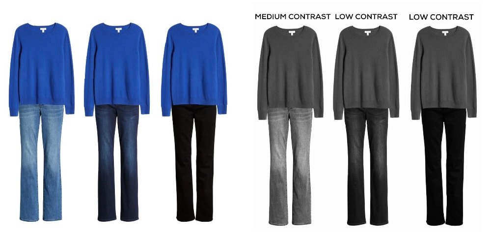
Now let’s try a deeper sweater with the same jeans.
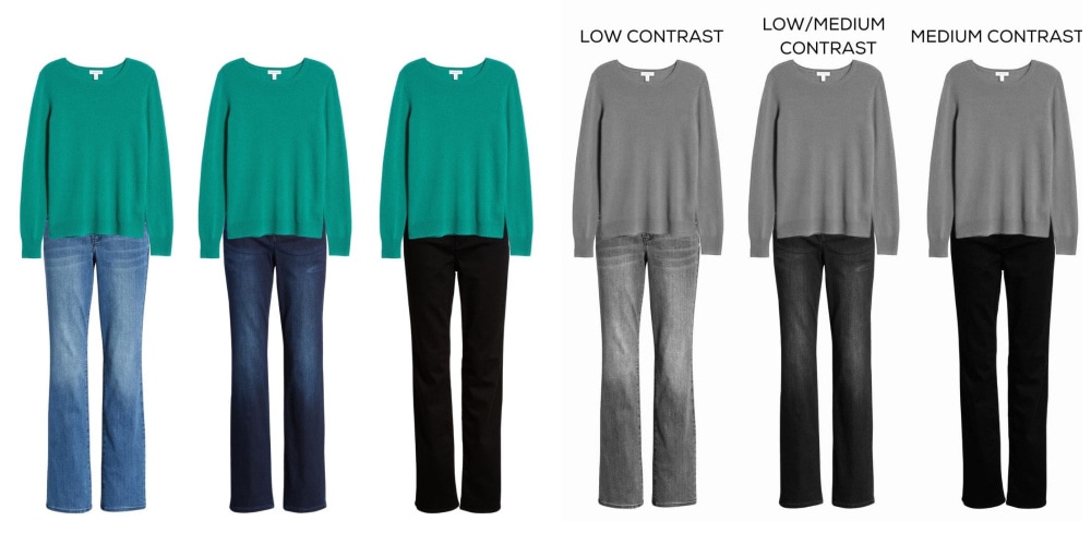
Now here’s a sweater with a medium value and the same jeans.
Try this yourself. Do all the grays meld softly, or do your eyes stand out? Is your hair noticeably darker than your skin tone? The comparison is what shows your personal contrast level. With practice, you’ll learn to recognize the contrast levels in outfits so you can wear ones that match your own. These will be the most flattering, so you’ll look the most vibrant and visible.
Hair that changes from black to pale gray lessens your personal contrast level, so you will look better in color combinations with lower contrast. You may also look better wearing the lighter colors within your palette. Remember, you will not change seasons, just the colors that flatter you most within those seasons…unless you were mistyped in the first place.
Do you pay attention to contrast levels in your outfits?
Thanks for reading, and remember to wear what makes you feel confident.
This post is so informative – my hair was dark brown – it’s now turned gray. I’m so glad that I stopped coloring, and although I probably look older, I feel more authentic…and I get compliments on my hair all the time.
I don’t wear much color, but have recently added a few coppers and greens to my wardrobe. Contrast is something I really hadn’t considered, although I don’t tend to wear very light shades – as I feel they tend to wash me out. I can’t wait to to do your exercise – a closet edit is definitely in my future, I’m sure.
What an enlightening post! I don’t think I ever really understood about the color contrasting. It got even more confusing when my dark hair came in silver after chemo. Now I can finally figure it out, thank you Jennifer.
I’m glad you liked it Rose
Love this post, Jennifer! I am low contrast, with lite brown highlighted hair color, fair skin, and hazel eyes. But my eyeglass frames are navy blue, so I feel like that provides some balance to enable me to wear outfits with at least a medium level of contrast. Would you agree?
It’s hard to say without seeing how dark the navy is. Try a black and white photo and see if they harmonize with your contrast levels. They will add visual balance by drawing attention from a darker top, up to your face.
Mind blowing!! I’m gona throw out everything I own and start over! A whole new look for 2022!
Thanks Jennifer, you’re the best.
Lol! Have fun Donna, but go slow 🙂
This is interesting! You look great in blue but I’m sure you know that😉
Thanks Jennifer for a great post! Value is difficult for many people to understand. I’m an oil painter and if you get the values right then the colors will likely follow. Funny, that I’d never considered it in clothing but I can see now why I’m drawn to certain combinations!
You’ll find it fun to incorporate into your outfit choices.
This is such a great explanation of a subject I was often frustrated with. Thank you for the examples. I will keep this to return to again. I have very dark glasses frames, and as my own colouring has softened I think it is time to revisit this and perhaps find a softer frame for the next pair. These posts are so helpful, I hope you will continue along this idea to help clarify for those, like me, who really appreciate it.
I will Dianne. I’m overpowered by dark frames and find it one of the most difficult parts of finding flattering glasses!
This was helpful. Thank you. I should know all this at my age but you made it straightforward.
I’m glad it helped.
Jennifer, thanks for giving me the best explanation I’ve read of a very complex subject. I find it really fascinating! Great job and examples.
Thanks Kate!
I would love a post on choosing glasses that go with your contrast level/colors. Examples of how different ones look on you would be helpful.
Very educational and I will be using this information to evaluate my outfit choices. Thank you!
I am looking forward to taking photos and trying out monochrome. Thanks for this column — it’s interesting and helpful to have a clear explanation of contrast.
I’d love to hear more about saturated color vs. tints and shades, too!
I’ll dig into saturation in an upcoming post.
Very helpful post! I haven’t focused on contrast levels intentionally. I have adjusted them when previous colours seem off now that my hair colour is lighter. I have noticed it in makeup too, particularly lipstick.
I still have a lot of black tops. Can I adjust the contrast with scarves?
They can certainly help. Try scarves with lower contrast within the pattern, not just a lighter scarf. And remember these are just tools to use. If you absolutely love higher contrast, you should wear it:)
Brilliant post! I never thought about this before. I’m looking at my wardrobe now and it majors sense why I’ve been choosing what I do. Thanks for breaking it down like this. Very helpful.
This is the best explanation of contrast levels that I’ve seen. Well done Jennifer.
I’m glad you enjoyed it. Thanks, Yvonne.
Great info. I now understand why even in my color palette some outfits work better than others. I’m a green eye, fading redhead and now I know why I’ve been choosing more medium colors. Thank you for the b/w photo suggestion. Anxious to try it.
Let me know how it works! I’d love to see your photo
Excellent post. I was unaware of the importance of contrast of color. I thank you for bringing it to my attention and for a clear explanation.
Thanks for helping me understand why, since my hair is now white, my eyes medium blue, and my skin very light without pink, I now can wear pale shades that did not look good when I had dark brown hair. I recognize how nice some soft colors look now but never had an explanation for why. Contrast!
Yes! You sound more low/medium contrast now which would love those lower contrast combinations.
I found this post very instructive. I’ve had this very same question since I turned gray. I know I’m a winter but was wondering if I had “turned” into perhaps a summer. Was even considering having my colors redone. I look forward to more on this subject. Thanks.
My pleasure. There’s a lot of misinformation out there on seasonal color analysis. I’m always surprised to read people say you will change seasons as you age. That’s like saying we change blood types!
Thank you so much for explaining this! It makes sense & helps me understand why I am more drawn to low contrast neutrals & monochrome outfits.
I’m not sure this is the same thing you’re Illustrating here, but as I’ve studied my clothing and your blog I’ve found that my winter pale complexion looks best with a mini pattern (paisley or print) not large loud prints, layered with my solid V- necks or cardI look best. They perk me up visually. Like your looks here, I’ve used my denim shirts too, but there is just something about the small prints or geo patterns that look best on me. Of course I apply blush or bronzer too…….
The contrast in pattern is equally important so that may help explain why you like them.