How To Find Your Personal Contrast Level And Why It Matters
A reader wrote in with a question. I get more than you’d think. She’d gone gray and noticed that some colors in her seasonal palette were suddenly working better than others. She wanted to know if there was a formula she could use to sort it all out.
There is, and it starts with contrast.
Most people focus on finding the right colors for their complexion, which makes sense. But your personal contrast level is just as important, and it’s often the missing piece when an outfit feels a little off, but you can’t quite put your finger on why.
Before we get into how to find yours, it helps to understand how color actually works. Every color has three components. Hue is the color itself, think red, yellow, blue. Value is how light or dark that color is. Saturation is the intensity or purity of the color. All three play a role in whether a color combination flatters you or flattens you.

Our hair color, skin, and eyes all have a value (light to dark) on a sliding scale. Our personal contrast level is the difference between them. Wearing contrast levels that match your own contrast levels is as important as whether the undertone is warm or cool. In some instances, it’s more important!
High contrast is when there’s a large difference in the lightness of one or more colors. For example, if you have very dark hair and light blue eyes, you have a high-value contrast. However, if your dark-colored hair has gone a medium grey, it will lower the difference (contrast) with your eyes. As our hair goes gray or silver, our personal contrast level will shift.
If you have light silver or blonde hair, fair skin, and pale eyes, you have a low contrast value and will look best in low-contrast outfits. Medium value contrast is when there’s a difference, but it’s not extreme.
Contrast levels that are too strong overpower and wash you out. Conversely, wearing a contrast that is too low reduces your visibility. Knowing and wearing outfits that echo your personal contrast levels keeps you looking vibrant and visible at a time when society often overlooks midlife women.
How to find your personal contrast level
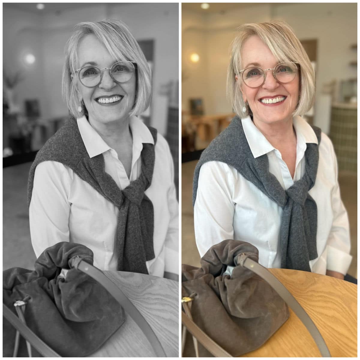
The easiest way to see your inherent color contrast is to take photos of your face and hair. Then, use the settings on your phone to change it to a grayscale, monotone image. Now you’ll see the difference in the intensity of your hair, eyes, and skin. I have makeup on in my photos, but you can still see the difference.
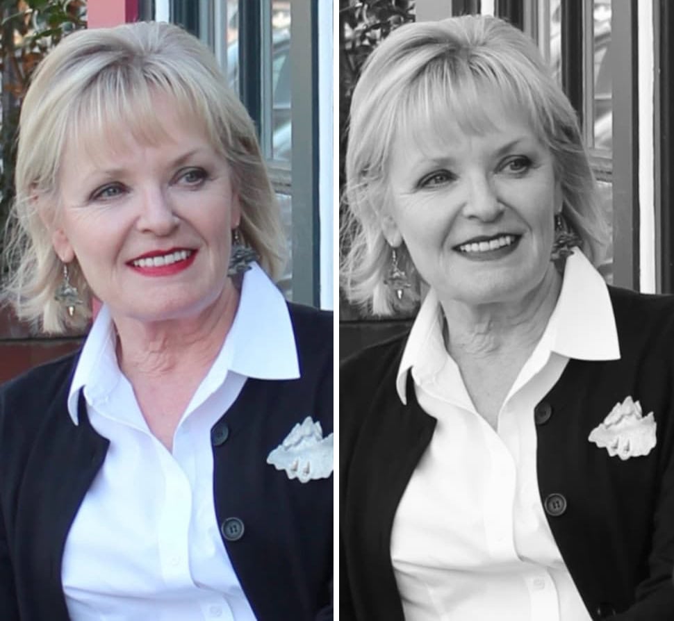
The black and white have a strong contrast that overpowers me. The red lipstick attempts to make it flattering, but falls short in the monochrome image. The black jacket is intense against my complexion. Its contrast with the white shirt draws your eye to the garments rather than to my face.
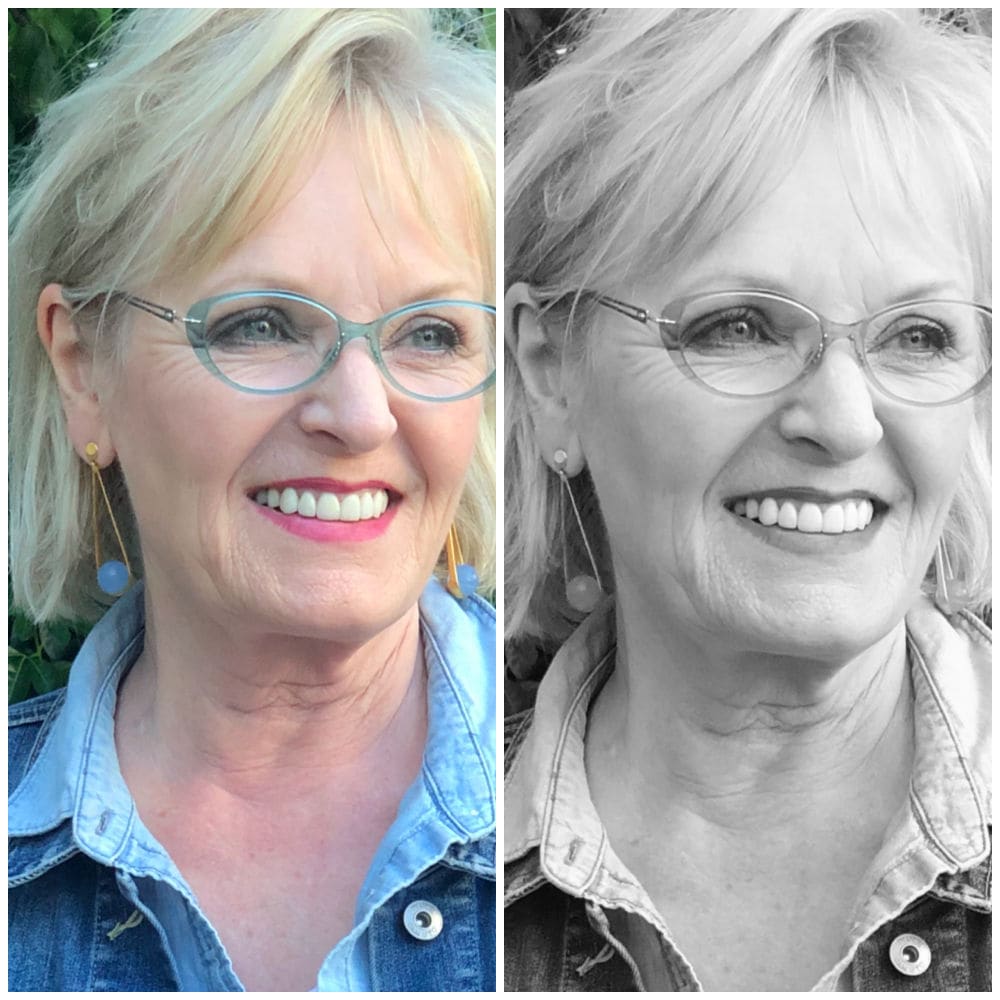
In this photo, I have highlighted pale ash blonde hair. Along with my fair skin and medium eyes, I have low-to-medium contrast values that match the chambray shirt and denim jacket. My eyeglass frames and lipstick are also a low contrast, which doesn’t overpower my coloring. My low intensity is also why I am flattered by monochromatic outfits, as they are the epitome of low contrast.
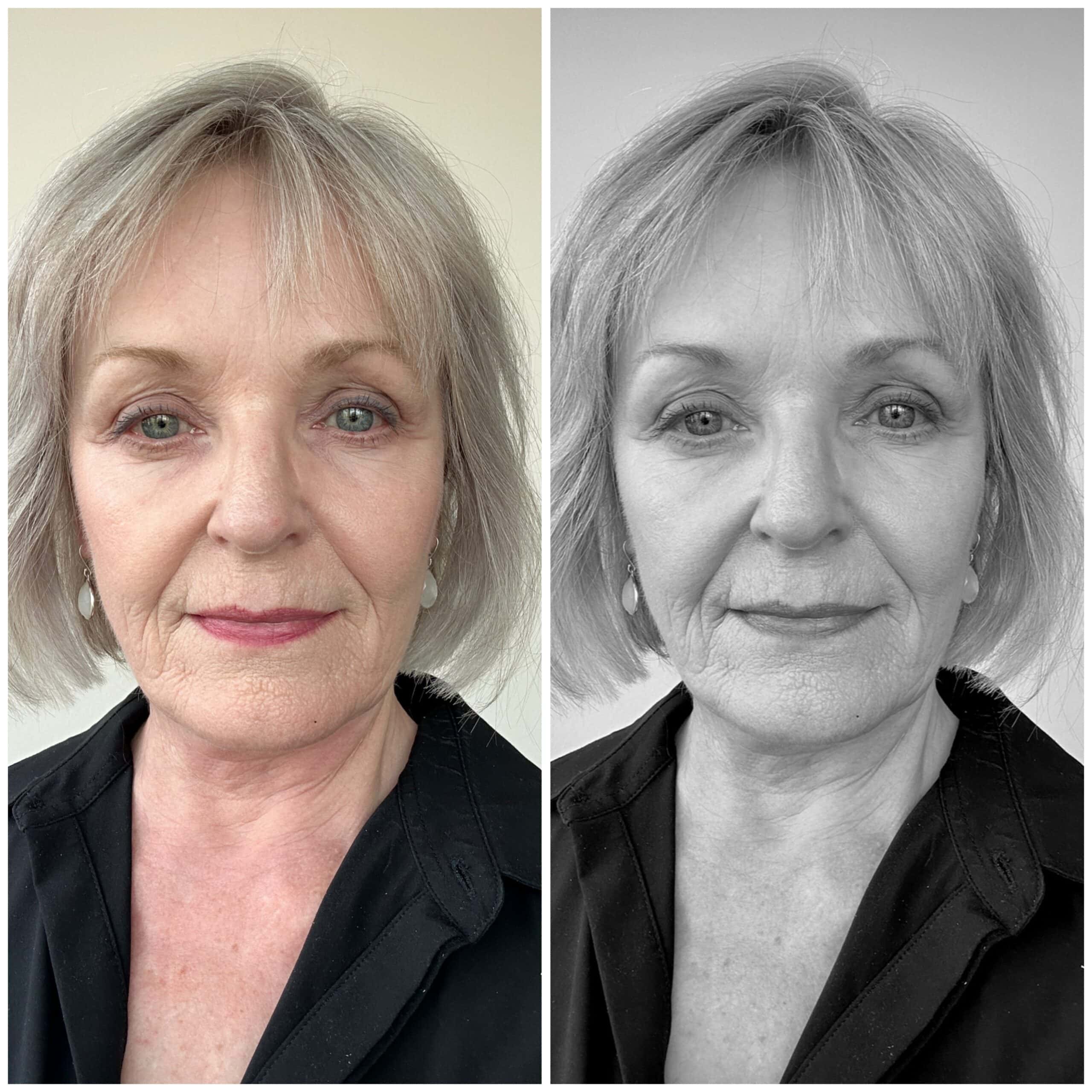
Since I’ve let my hair go natural (silvery), the contrast between my hair and eyes has become even softer than when I was highlighting it. This black shirt looks even starker against my low contrast coloring, so my head looks like it’s floating.
Below is another example using outfits. The same sweater with different-wash jeans is a great example. High contrast is when there’s a big difference between one or more colors. Low contrast is when they’re very similar. Medium contrast is when there’s a difference between them, but it’s not extreme.
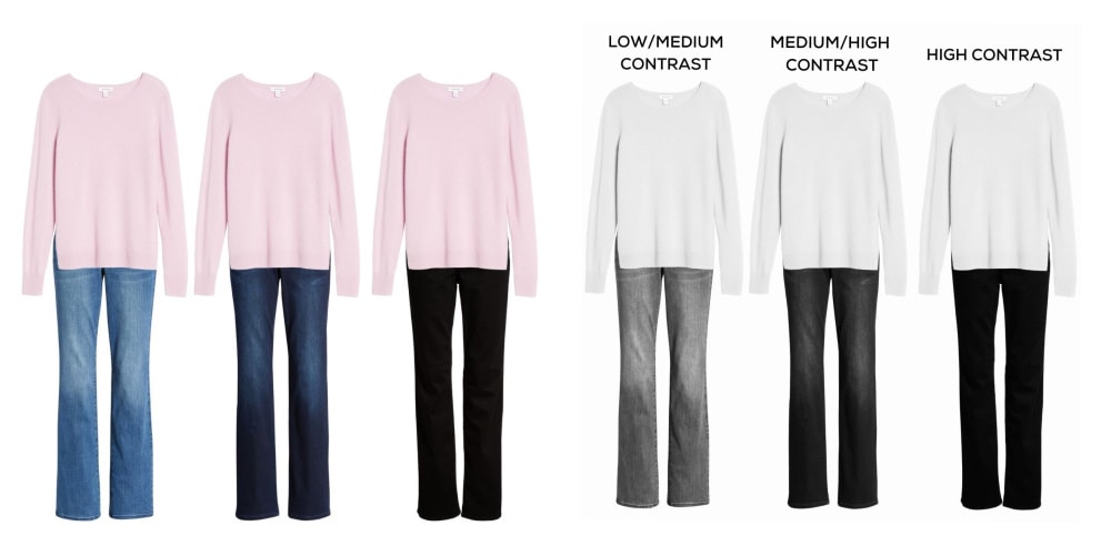
When we remove the color, you can see the contrast levels. The light sweater and deep-wash jeans have a high contrast, which would flatter someone with equally high contrast. If you have white hair and deep brown eyes, you can wear a stronger contrast.
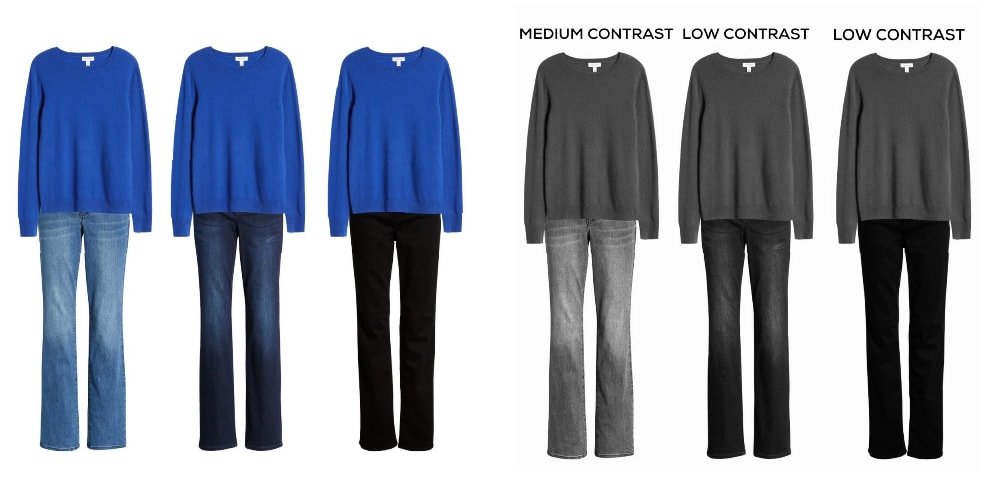
Now let’s try a deeper sweater with the same jeans.
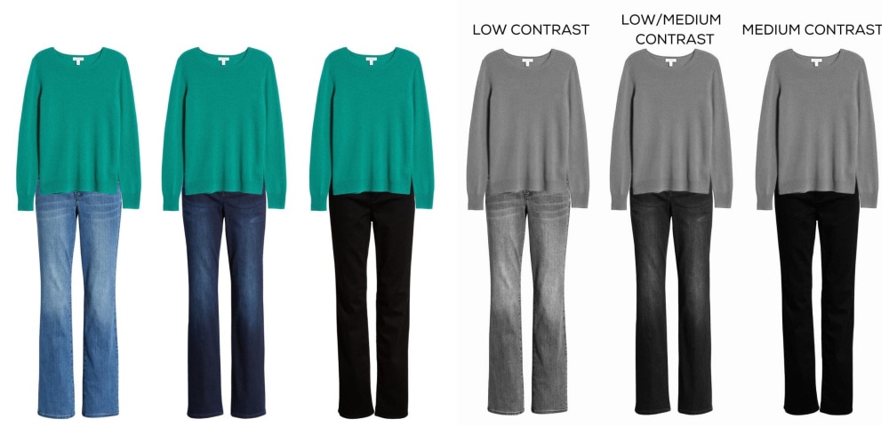
Now here’s a sweater with a medium value and the same jeans.
Try this yourself. Do all the grays meld softly, or do your eyes stand out? Is your hair noticeably darker than your skin tone? The comparison is what shows your personal contrast level. With practice, you’ll learn to recognize the contrast levels in outfits so you can wear ones that match your own. These will be the most flattering, so you’ll look the most vibrant and visible.
Hair that changes from black to pale gray lessens your personal contrast level, so you will look better in color combinations with lower contrast. You may also look better wearing the lighter colors within your palette. Remember, you will not change seasons, just the colors that flatter you most within those seasons…unless you were mistyped in the first place.
Do you pay attention to contrast levels in your outfits?
Thanks for reading, and remember to wear what makes you feel confident.
If I understand, black slacks would be better with a charcoal or medium to navy top, than red or pastel in a low/medium contrast? Really appreciate you sharing your knowledge.
Yes. That combo has a lower contrast. Black with charcoal or navy is usually low contrast and so lovely together.
I found today’s post so very interesting! I have gone a lovely silver grey around my face and have recently being wondering if I need a new colour palate. I was told I was a winter and have always enjoyed wearing my beautiful bright, bold colours but recently I felt as if they were overpowering me. I will try your tips and see if I can find a way to feel comfortable again. Thank you so much,
Your coloring sounds gorgeous. I hope this helps
Thanks so much, very informative post. From you I have a better understanding of the contrast between the garments we are wearing together. I am low contrast, but the lightest pastels wash me out. I prefer medium colors to medium light. I have found that little pops of a brighter color are OK too, such as an outfit in shades of blue with a red or bright pink lipstick or an accessory like a dark red handbag or leopard print flats. Fashion principles seem to follow interior design principles in that variety and texture are ideas to keep in mind. So for example, an all blue outfit is fine, but some variety in texture keeps it from being boring. Your example of the blue blouse with denim jacket shows that. Thanks Jennifer
I’m so glad you liked this. I was hoping it wasn’t too technical or boring.
Excellent post! Thank you.
Interesting and informative article! It explains why I always change when I attempt to wear a white or cream top with black pants, even though I like the look on others. Sometimes adding a third piece in say, charcoal, will mitigate the stark contrast.
Yes! And a scarf with lower contrast close to you face can help
Thank you for this explanation as I think my tendencies toward a more diffused color palate was coming forth in my outfit choices for awhile now. I have noticed my hesitancy wearing some of the more bolder, intense colors I used to wear often; now, they seem to be sitting ‘idle’ on the hangar! I get it now as you’ve offered a great explanation to what was happening by my own eliminations of certain pieces!
Awesome! Maybe trying different combinations will help too
What a great conversation today. I just went from very light hair to darker hair. I have light skin and blue eyes, but my blonde hair has darkened. Therefore, I decided to go with my newly darkened hair color. Now I have a contrast decision. Your timing is perfect!
Interesting! It sounds fun
Help, I still color, but I would be fully gray if not. Just not ready yet! I do not color as dark brown as I once was. I have brown eyes, medium skin, with yellow undertones. I think I tend to look blah all the time. Give me some help. Eyeglasses are a tortoise tone.
Maybe you would feel less blah with a touch of a brighter color or some pattern?
Excellent presentation on a topic that has always confused me. Love your examples!
First off, I love the shape and style of your blue eyeglasses. Would you share what brand they are? I never seem to find something like that. Eyeglasses are one of the most difficult things to choose in my life.
Now I know why sometimes my outfit seems to “feel” great and sometimes not so much even though they might be in the same color family. You have a talent for taking the difficult subjects and making them easier to understand.
My frames are by Aspire. You can check local optometrist offices to see if the carry them. I struggle to find great frames too and they’re so important.
Thanks, I’ll take a look.
Love this! Definitely something to consider. Thank you.
So helpful: I am a “winter,” had black hair, fair skin and hazel eyes. My hair is bright white now and I have had to re-think how I wear my favorite colors. I used to look good in high contrast and now I look washed out if I wear what used to look great—-like black and white.
Bright white is still very intense but it sounds like you may have a medium contrast now. Black with navy or with charcoal could be more flattering.
What always confused me was the difference between contrast and intensity. By George I think I’ve got it. Thanks Jennifer. My hair turning silver and losing color in my skin changed my whole idea of what color to wear. I went from rosey cheeks, med ash brown hair to pale skin and silver hair. Shock.
It sounds like lower contrast:) I’m glad this helped, Eve
Wonderful informative article. Thank you!
Very informative post! I feel I will make better styling choices and purchases based on this valuable knowledge. Thank you!
This is brilliant! Did you know yours is my favorite blog!
Thank you!
This explains so much! I sort of kinda maybe got this before, but you have crystallized it for me. I used to be a medium/high but with age I have become a medium/low. Some subtle differences there, but now I understand why some of my older clothes just don’t look “right” on me…and why I never quite love myself in either black and white, or faded denim! Thanks for the eye opener!
Fabulous info, thx so much.
Very interesting. Never thought about contrast before.
My eyes usually glaze over when trying to understand the whole subject of color palettes and skin tone and aging etc.. I actually understood this explanation and found it very illuminating!! (No pun intended!) Thank you, thank you Jennifer!! I usually “go with my gut” on the colors and combos I choose, but now I understand why some work and some don’t!!